The united voice, tone, and look of STORE
Colors, gradients, typography, logos, and downloadable assets for STORE projects and partners. Use these guidelines to keep the brand consistent everywhere it appears.
01Colors
The primary colors used across STORE projects, labeled with hex values.
02Gradients
The primary gradients used across STORE projects.
03Typography
STORE uses Montserrat for online and printed communications - Regular for headlines, Light for body text.
04STORE Logos
The preferred STORE logo pairs the brandmark (graphical icon) with the wordmark (text). Together they form the complete logo. These should appear on all STORE communications. The current lockup names the protocol in full, STORE PROTOCOL; pick the horizontal version where you have 300px of width or more and the stacked version below that, where the horizontal tagline stops being legible.




The previous lockup, kept for anything already carrying it.



05Store Cloud Logo
This is the preferred version of the Store Cloud logo, slightly different than the STORE protocol logos above.

06Brandmark
The brandmark is used as an icon or profile image where the full logo won't fit.





07Wordmark
This is the STORE wordmark. It should be used in almost all cases. It is preferred that the wordmark is paired with the brandmark, but if space is limited than the wordmark by itself is sufficient.


08STORE Logo Reveal
STORE logo reveal in 3D rendered video format. Video asset pending re-export - contact team@storecloud.org for the current file.
09Powered by STORE









10Brand Logos









Division banners





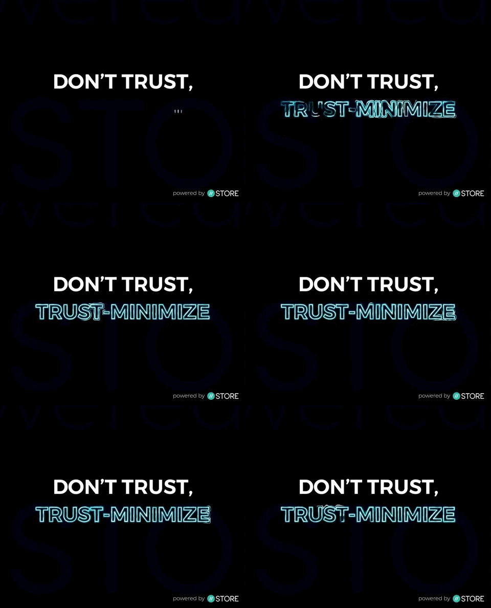
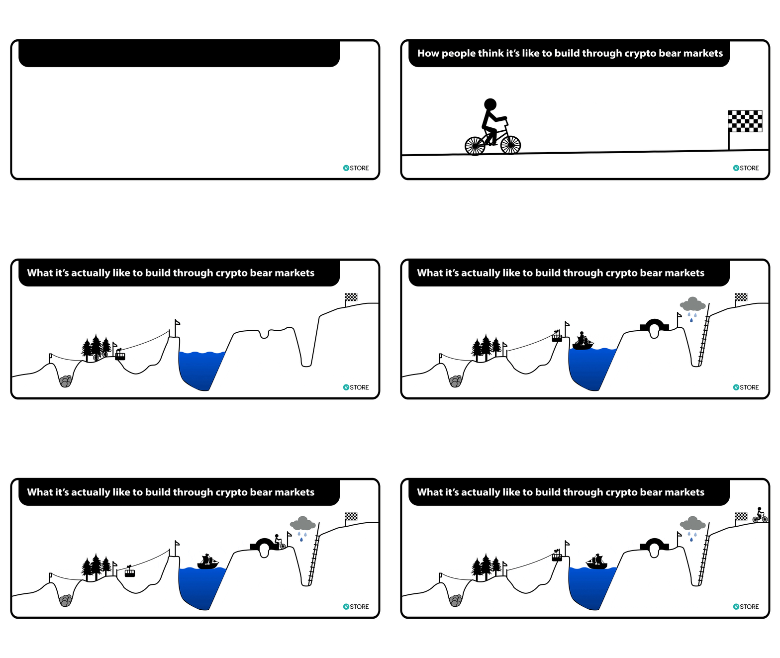
11STORE Memes
Collections of memes, GIFs, and stickers from the STORE team and community.
12Social Backgrounds
Collections of GIFs and images to be used as backgrounds on Facebook, Twitter, and other platforms.







14Geographic Banners










Electricity for Web3
Need something not shown here? Reach the team for the full brand asset library, powered-by lockups, and partner co-branding.
13Social Media Image